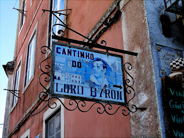
A small café at one of the narrow old streets of Sintra.
Lord Byron loved Sintra and described it as 'a glorious Eden' in his lengthy narrative poem Childe Harold's Pilgrimage.
*
For more sign shots check Lesley's 'signs, signs'
*
For more sign shots check Lesley's 'signs, signs'

24 comments:
It looks like a place I'd stop for lunch if I were there.
I bet it make the best sandwiches and the coffee is to die for.
Encantador o "Cantinho do Lord Byron"
Jolie enseigne ... dans la tradition ! Pourtant le damier à droite laisse penser à une clientèle branchée !
I would love to visit Sintra! Great shot for the day! Lord Byron did have great taste! Hope your week is going well, JM!
Sylvia
a beautiful signage. a little old world feel to it, so pretty.
I would love Sintra as well!
It looks like it is a tiled sign. It is beautiful
That's a beautiful sign. Love the porcelain tiles and the wrought iron frame, nice capture!
Oh yes, lets go!
Oh, Lord! Not Byron again! But Sintra does appear to be a very special place!
I have a question: Where do you find the widget for your "My other blogs" gadget in your sidebar? I can't find anything like it and would love to use it on our new site.
I was watching HGTV the other night and the segment was about a woman from the US buying an apartment in Lisbon. Very interesting! I think she was a teacher.
the guy in the sign looks like our national hero, Jose Rizal.
Sign:Wanted
Great signage. MB
Nice sign find.
Thanks for sharing this. I guess I would have taken a look, a drink or lunch inside.
Beautiful sign!
Great variety in your signs.
Gosto imenso desse lugar!
A foto está magnifica!
Léia
very interesting. i'd love to come inside and try the food.:p
http://savorthebite.blogspot.com/2011/02/signs-take-it-slow.html
to sit where the dashing young poet might once have sat and imbibed... a dream
If my eyes do not deceive me, that sign is a series of ceramic tiles, painted to look like one image. Well done! And they look great embedded in the wrought iron. The blue contrasts wonderfully with the red building.
He had been almost everywhere, here included. Love the sign!
Lovely sign! Like all the colours in this pic.
I love that sign! It really looks great in that wrought iron frame.
From what you've shown I can see why he loved it :)
Post a Comment